Faces:
A study on connecting names to faces.
Project Description
People everywhere struggle to remember the names of others. It is an often daunting task where most people fear the embarrassment of missing someones name. Another piece of the puzzle is the pronunciation of the names. Though this affects everyone, this case study will focus specifically on teachers. Their job brings them in contact with new groups of people every year, new faces to know and names to remember.
I started my process with simple discussions with a few teachers at the middle school nearby. I posed a scenario to them: it’s the start of a new school year, you have a class of entirely new students, how do you prepare?
Initial Concept
There were a variety of answers ranging from flash cards, to just memorizing the roster and hoping for the best. I focused on the flash cards and asked about their usefulness. Most of the teachers said that they almost always missed a bunch of students and had to source the photos from previous yearbooks or social media. This made them useful, but time consuming to create.
I thought about the current space. There are a myriad of methods available to the teacher to prepare for their classroom ahead; flash cards, apps that mimic the flash card experience and good old-fashioned memorizing the list are all tools available. However, the experience is not as immersive as it could be. Additionally, as a person who constantly had their name mispronounced, there was another part missing; how could a teacher learn the pronunciation of a future student’s name?
This took my thinking to leveraging the Google speech processing power. How could the experience be improved with an interface the user could talk to?
I started to envision an app that could:
- Show the user a face.
- Hear the users response.
- Grade their performance.
For the teacher portion of the app, the requirements for the interface seemed relative clear. However, this data has to come from somewhere. I would need a secondary interface for the students (or parents / guardians depending on age) to upload an image, enter the student’s name and train the system on proper pronunciation.
Screens for Success
I started by listing out some of the required screens and the core functionality within.
Teacher Portion
- Welcome / Onboarding
- Start Screens
- Class Set-up
- Create a class / group
- Enter Students
- Email Students
- Print hand-out
- Practice Screens
- Photo with ability to speak or type name
- Second chance
- Result
- Move on to next
- Summary
- Percentage correct
- Problem students (ability to hear pronunciation)
Student / Parent Portion
- Simple URL
- 1 Screen to rule them all
- Upload photo
- Speak Name
- Correct Name (if needed)
This list was the beginnings of my architecture diagram.
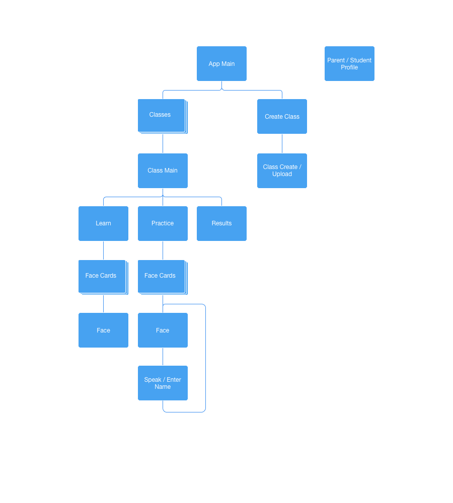
Basic App Flow
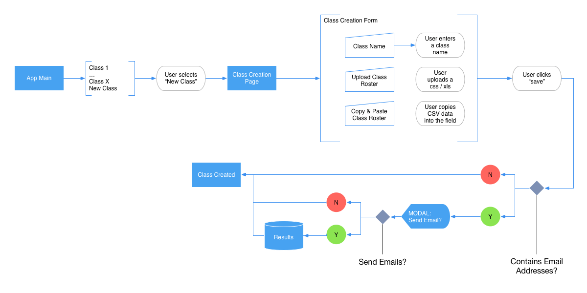
Before the user can begin, they must first create and setup a class. This class will hold all of the students photos and data. This will allow the user to potentially have multiple classes. All that is needed for a class is some kind of name for the class and a list of the students within the class.
To simplify the class creation process, this would be both app and web-based. The teachers with whom I talked had their class rosters available to them in Excel or CSV format. Using this, I would create the interface for simply uploading the file to the application and this would create a group. Assuming the teacher has the students' email addresses at their disposal, they could enter these as well with the roster information and an email could be created that would prompt the student / parent to fill in the photo / name portion of the app. As a fall back, if the teacher had a late add, or was unable to acquire a CSV-like format, they would be able to add the students one-at-a-time.
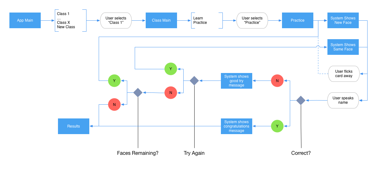
Once the data was loaded into the system, the teacher could open the app on their phone at their convenience and play through. The app would hold a stack of 10 cards, the teacher would look at the faces and either speak or type the student's name, depending on their environment. If the teacher gets stuck, they can click on a hint button. This would give a portion of the name the first time, and the full name the second. At any time, the teacher can flick the card to the left to temporarily dismiss that student. This dismissal would be noted in the summary results page for them to reattempt later.
After the 10 cards have been presented to the teacher, they will be directed to the results page. This will give them their score as well as the students who were correctly identified, dismissed, and missed. On this page, the teacher will be able to see their successes as well as learn more about the ones with whom they need more practice.
Initial Concept Testing
I ran the prototype by a small group of teachers from the near-by middle school and while the idea was met with a warm response, but they pointed out that though this was a great way to practice the names, they needed a way to initially learn who each of the students were.
I went back and examined what would be needed to add a learning mode to the app. I decided that it would make the most sense to make a similar mode of play. The teacher could go into the class screen and decide if they wanted to go into the Learn mode or Practice mode. In the Learn mode, the teacher would be presented with the class pictures with the names underneath. In addition, they could hear the parents’ pronunciation of the name in case they were unsure. When the teacher was satisfied with their knowledge of the class, they could next go into the Practice mode. Here they would actually practice the students’ names and get graded on their accuracy.
Concept Wireframes
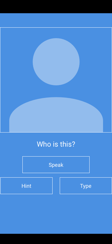
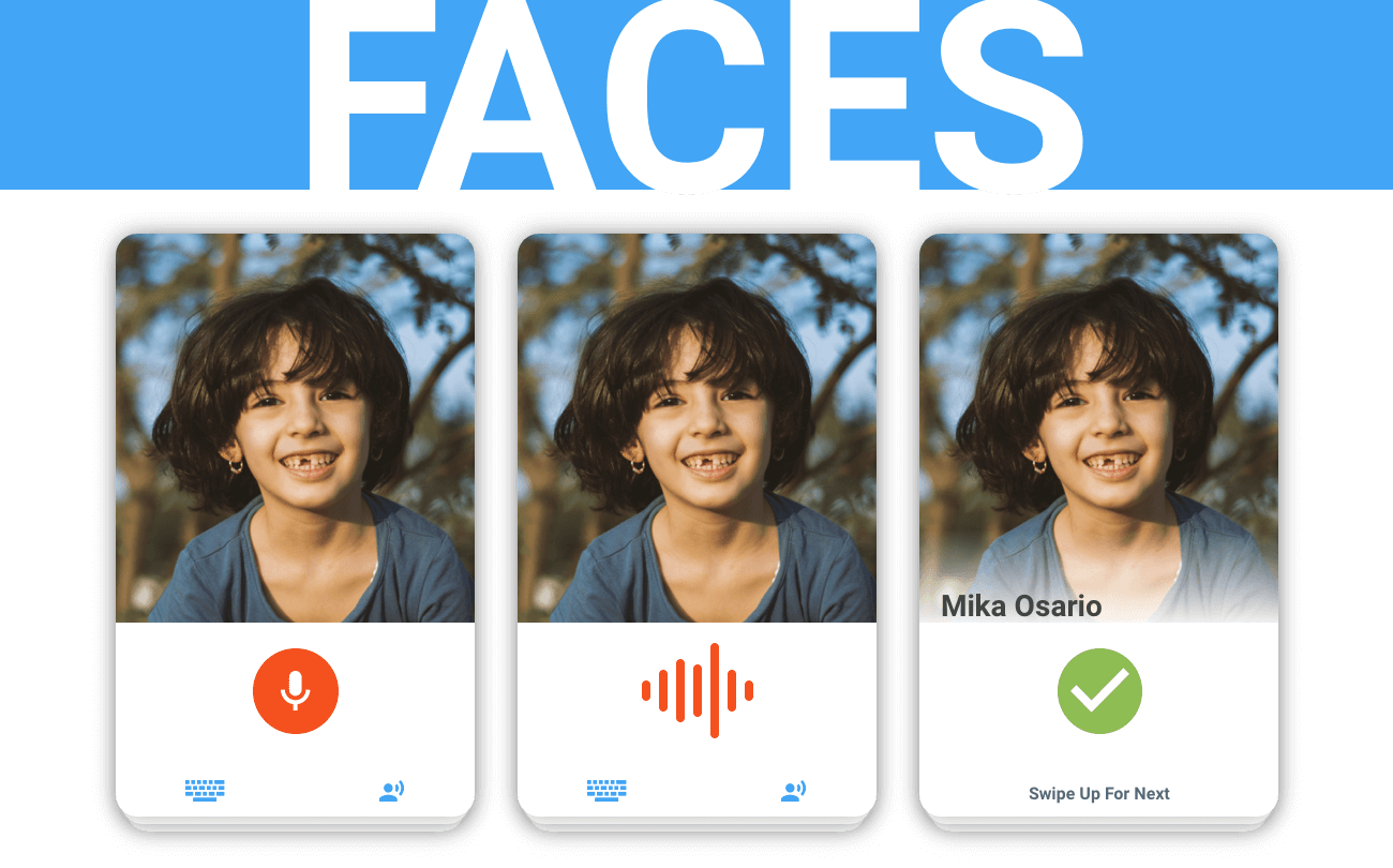
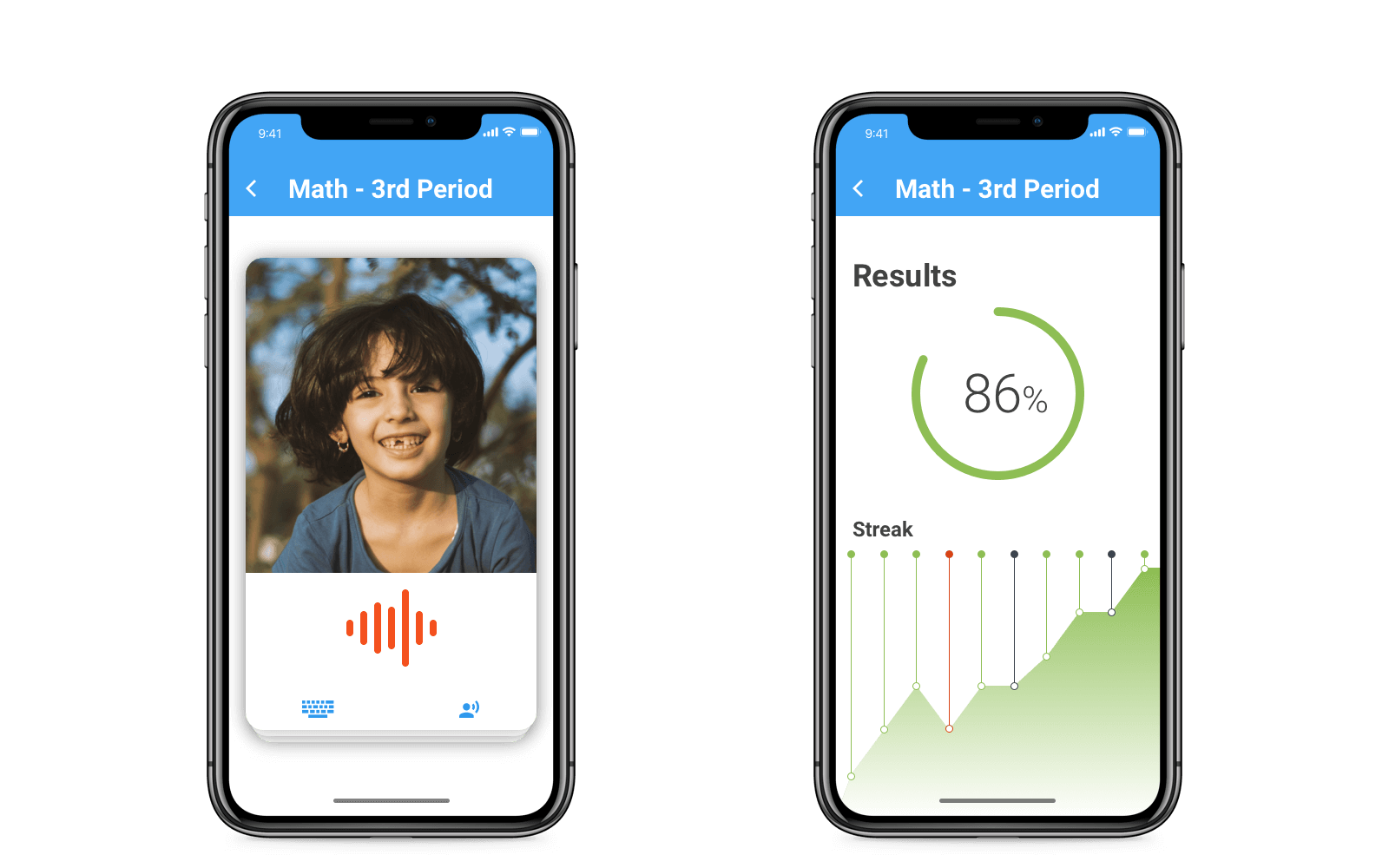
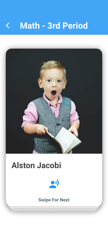
Practice Screen
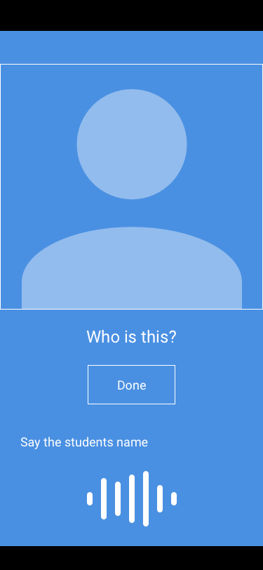
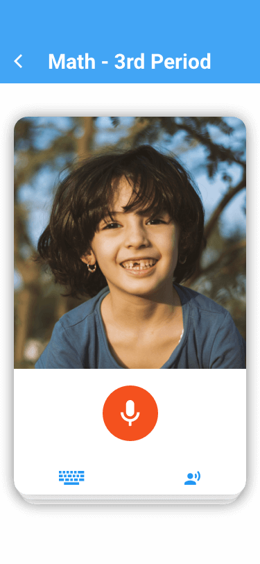
Practice Screen - Voice Entry
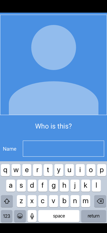
Practice Screen - Text Entry
The practice screens are designed to simulate the flash card experience. There is a stack of cards, each containing an image that the teacher will interact with, they are able to respond to the image within the card, or dismiss a card for later.
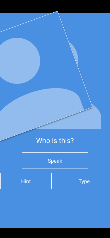
Practice Screen - Skipping
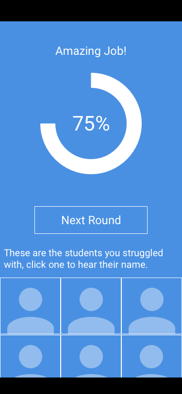
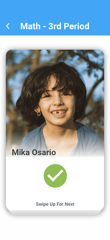
Results Screen
The results screen at the end summarizes the teacher's performance and helps to indicate areas of improvement.
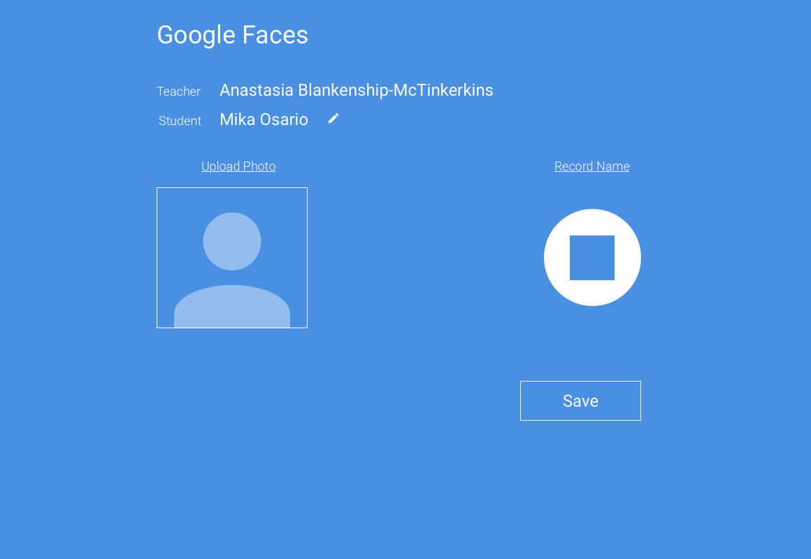
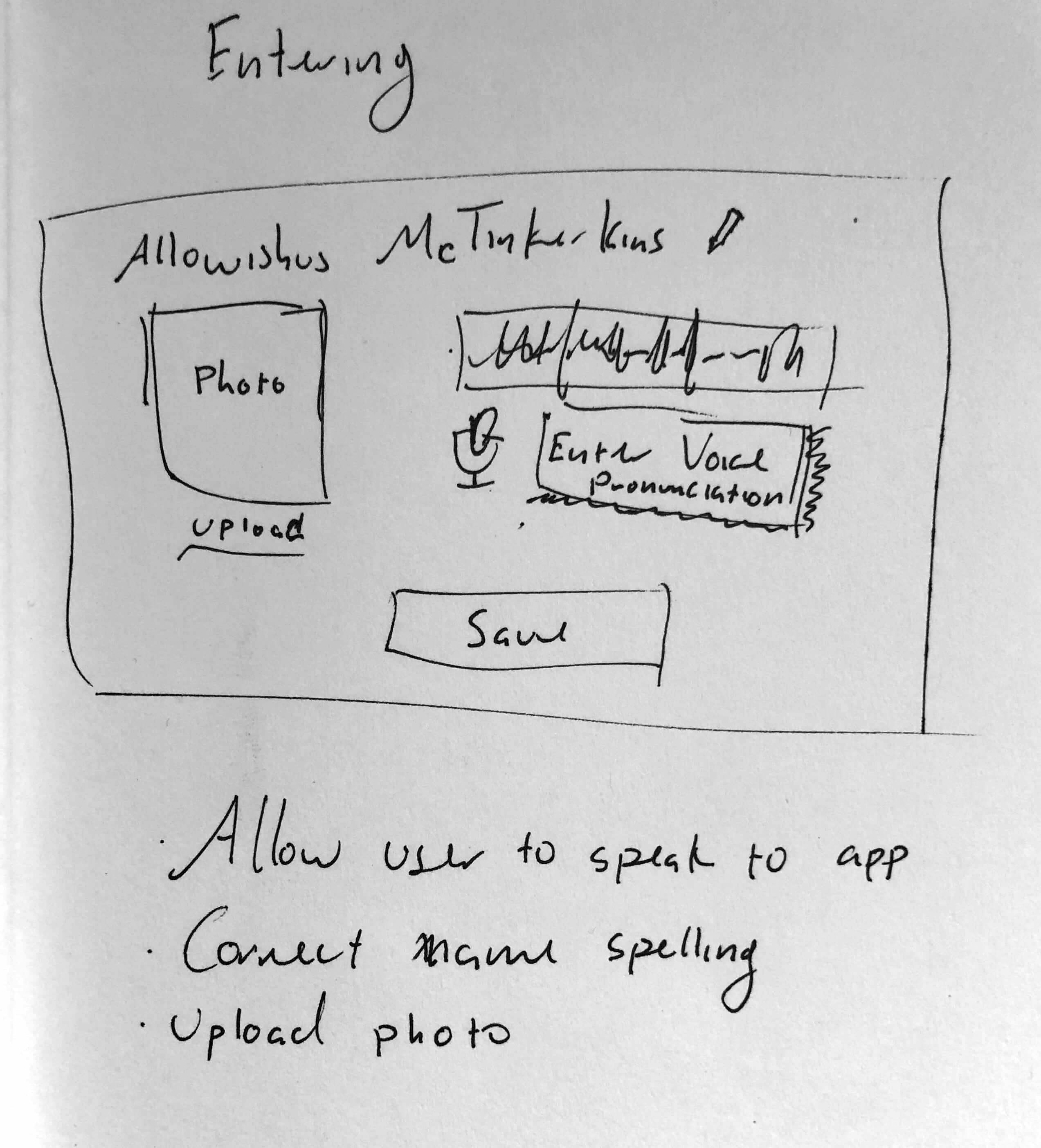
Parent Name Entry Screen
The data entry screen is designed for simplicity. Since the ask is on the parent, the interface should make the process as simple as possible.
Design Inspiration
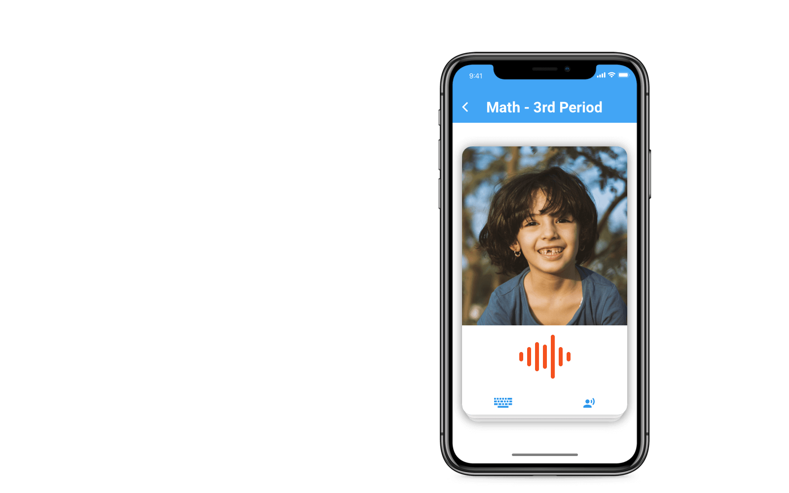
In thinking about the design, my focus was on minimalism. This is an app that serves a purpose. It trains and helps to educate a teacher. On average, the teachers I talked with were busy, so I wanted to create an interface that employed simple gestures and visual cues. I decided to maintain the metaphor of "flash cards" with a stack of cards. This would visually indicate to the teacher how many students they had left in this particular session. Moreover, the interaction with the cards could indicate important visual information.
The card animations would be a left, right, or upward flick to dismiss the card and move on to the next. The trick would be in timing the animation and the user's movement to ensure that a card was not accidentally discarded. If the user decides to respond, the microphone button would animate into the volume meter, and then when the teacher is finished speaking, it will transform again to indicate if the response is correct or not. This animation will connect the user to the intractable elements. In addition, this allows the image of the student to never be obfuscated, further strengthening the learning.
Upon completion of the 10 cards, the teacher will then be taken to a results page with shows them the percentage they got correct & where they occurred. This will allow them to see if there was a pattern or possibly a time that could have impacted their performance. Below the statistics portion, the teacher will be presented with a list of the students they knew, the ones they skipped, and the ones they missed. Clicking on any of the student images would bring up a card similar to the "learn" mode for them to see the name and hear it spoken.
Final Prototype Testing
After getting my teachers to test the final prototype, there were a few interactions that were missing. Namely, the interaction for returning to the class screen. I quickly updated the prototype and continued on with the test. My overall finding were that the app tested well. The major comment being that they wanted to know how it would work with actual voice processing in place and if the parents would be on board with creating a profile for their children. This inspired me to ask a few friends who had children if they would be willing to submit such information.
For the most part, they agreed. The only caveat being that they wanted a way to know that the information could and would be deleted. To accommodate this requirement, I would add a link to the parent set-up page that they could re-visit after the class was over that allowed them to delete the child's profile. This would provide a reassurance to the parents that their child’s data was secure.
HEART Analysis
I analyzed the responses and data I had using Google’s HEART framework. For the most part, I was able to capture data across the board, with more coming as time passes.
There was a great response to Happiness. The teachers really enjoyed the experience and asked when the app would be available to download. This was encouraging. With more refining, I feel as though the app could succeed. Which brings us into the apps Engagement, though this one is a little more difficult to test in a short time, the users appeared to be engaged within the confines of the prototype. I had a few users who played along greatly and spoke to the app after pressing the record button!
For the final metrics, only time will tell. With a limited prototype and short session, I didn’t get a great understanding of their plans for Adoption or Retention, but all users were able to navigate with ease and could accomplish the tasks that were laid out before them.
Concept Screenshots
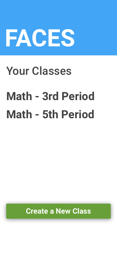
App Main with Class Selector
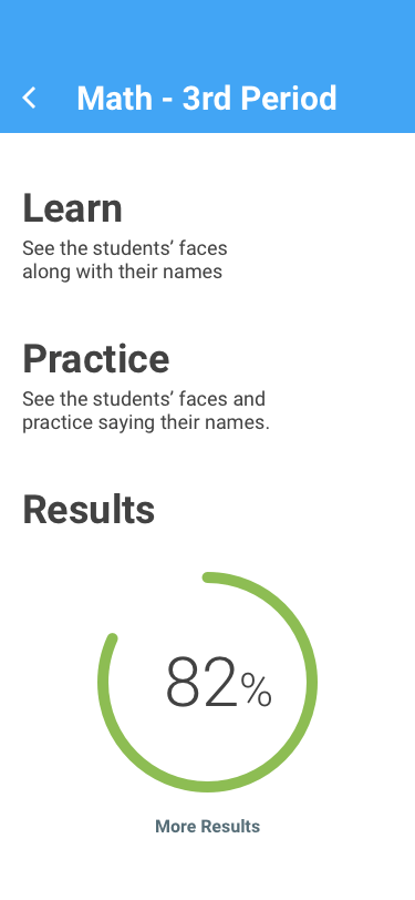
Class Main Screen
Learn Screen
Practice Screen
Practice Screen - Correct Answer
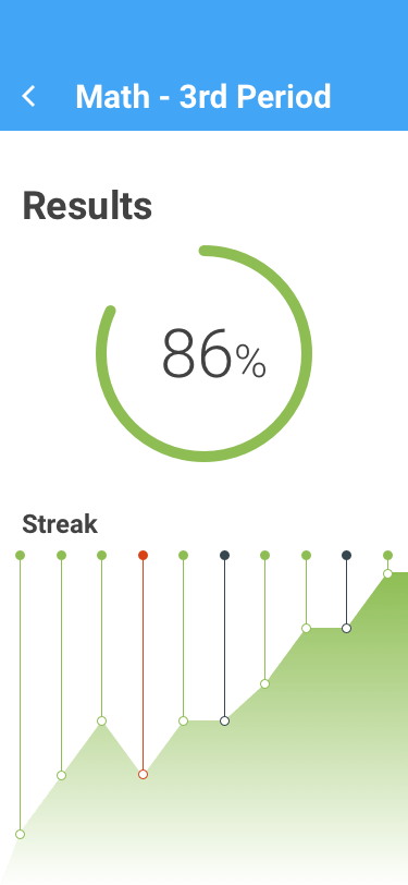
Results Screen
Future Plans & Lessons Learned
Badges.
I designed the app to behave in a game-like manner. I think that the next step in the success process is to add rewards to the user. This encourages continued play & helps to foundationalize both their learning by encouraging return visits. Taking this one step further, a social component could be added. This would encourage the teachers to compete against their fellow educators to learn their students' names best. And we all know that healthy competition only strengthens the learning.
Another area where I would like to pursue further study is in the semiotics of the interface for this app. In particular, the icon on the button that the teacher users to activate the speech recognition portion. I examined 2 options, one with the button being red and another with it blue.
The red button appeared to be more recognizable to the teachers, however, there could be collisions in recognition if a similar color is used to denote an incorrect response. Moreover, the microphone can denote “recording” which is not entirely the case here. Another option was to use the “speech” icon (used to denote a hint) but this seemed somewhat counter-intuitive.
For future plans, I would like to dive into a semiotic analysis and perform card-sorting with a new group of teachers. This would allow me to better understand their connection between the icons & language.
- Back to All Works
- Case Study: Faces App
- Case Study: Forio Epicenter
- Case Study: PennSTART
- Everest Simulation
- Alternative Fuel Vehicle Simulator
- Alternate Reality Teaching
- Texas Electricity-Water Nexus Simulator
- Investment Portfolio Simulation
- Latino Vote Map
- VenueConnect: Masters Thesis
- Compare-O-Marator